The Ultimate Guide to Landing Pages
Learn how to design, write, and test landing pages that will convert visitors into leads.
Landing Pages
What is a landing page?
A landing page is a website page with a specific purpose — the objective of a landing page is to convert visitors into leads. While there are many types of landing pages the intent the same — get more leads.
Landing pages contain lead forms that ask visitors for their contact information in exchange for something of value, otherwise known as an offer.
Landing Page Best Practices
Craft a benefit-focused headline.
Choose an image that illustrates the offer.
Write compelling copy.
Include the lead form above the fold.
Add a clear and standout call-to-action.
Give away a relevant offer.
Only ask for what you need.
Remove all navigation.
Make your page responsive.
Optimize for search.
Remember to use a thank you page.
. Craft a benefit-focused headline.
For every 10 people that visit your landing page, at least seven of them will bounce off the page. To keep that number low, your visitors need to know (and understand) what’s in it for them within seconds of arriving. Your headline is the first thing they’ll read, and it should clearly and concisely communicate the value of your landing page and offer.
2. Choose an image that illustrates the offer.
Yes, an image is mandatory, and it should represent your target audience. The purpose of your image is to convey a feeling — it should illustrate how your visitor will feel once they receive your offer. Certain images may work better than others, so you should always split test your options (which we’ll cover below).
3. Write compelling copy.
Don’t spend all that time crafting the perfect headline and finding your ideal image to fall flat when it comes to the words that will actually sell your call-to-action. Your copy needs to be clear, concise and should guide your visitor to the action you want them to complete. Compelling copy also speaks directly to the visitor by using “you” and “your” to make them feel engaged. We’ll go more in-depth on copy tips below.
Pro tip: Speed up the writing process by using generative AI to create a rough draft of your landing page copy, and then refine it to match your brand voice and tone.
With Campaign Assistant, HubSpot users can plug in their main points, features, and even CTA, and then generate a first draft in seconds.
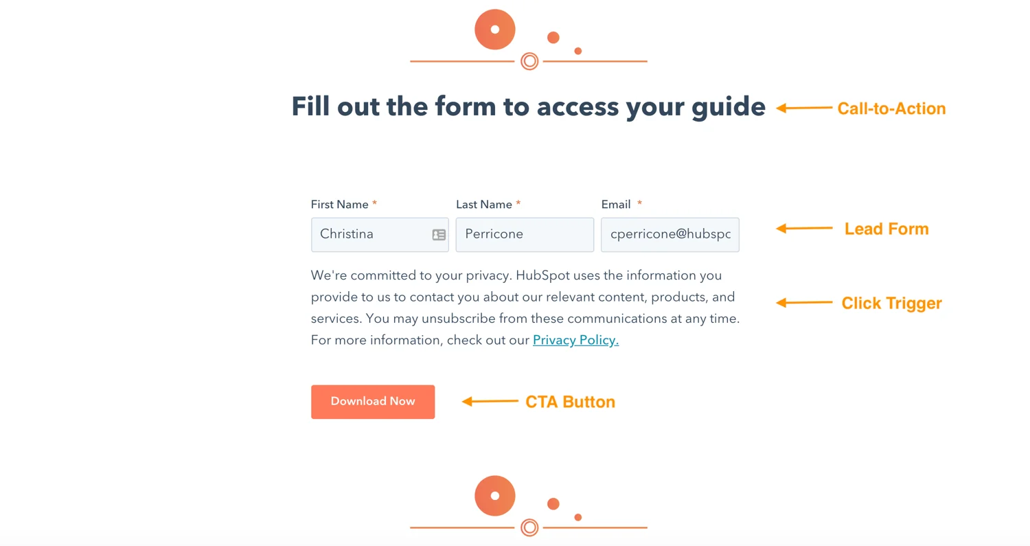
4. Include the lead form above the fold.
Your lead form needs to be readily accessible should your prospect want to convert right away — you definitely don’t want them searching and scanning your landing page to find your offer. “Above the fold” just means that visitors don’t have to scroll to get to the form — that it’s in view as soon as someone hits the page. This could be a form or an anchor link to the form. Even better: Design your form to scroll with the user as they move down the page.
5. Add a clear and standout call-to-action.
The call-to-action (CTA) is arguably the most important element on your landing page — it’s one of many elements that encourage conversion. The CTA button needs to stand out, meaning you should use a color that contrasts with other elements on the page. Be clear about what you want visitors to do, that is, use an action verb that spells it out for them, like “submit”, “download”, or “get it now”. More on CTA best practices below.
6. Give away a relevant offer.
Think of your landing page as a part of your lead’s journey to your ultimate offer — your product or service, that is. Your offer is the thing you give in exchange for your lead’s personal information. Not only should it be compelling enough for your visitor to provide their contact info, but it should also be relevant to your business. Say you sell horseshoes.
Your offer might be something like “10 Simple Ways to Size Your Horse’s Hooves,” because, ultimately, you’re going to ask that lead to buy your horseshoes. You wouldn’t hook them with an offer about organic farming because that puts them on a completely different path. We’ll talk more about how compelling offers below.
7. Only ask for what you need.
You want to gather as much information as possible about your lead, but how much you ask for depends on several factors: how well acquainted they are with you, where they are in their buyer’s journey, and how much they trust you. Ask for as little info as you need in your lead form to create a low barrier to entry. A name and an email are more than sufficient to nurture a new lead.
8. Remove all navigation.
Your landing page has one objective and one objective only: to convert visitors into leads. Any competing links — including internal links to other pages on your website — will distract from that goal. Remove any other links on your page to draw all of your visitors’ attention to your call-to-action.
9. Make your page responsive.
Just like every other page on your website, your landing pages need to be responsive to accommodate every viewing experience. The last thing you need is for your form to fall out of view on mobile devices. Give your visitors every possible opportunity to convert, no matter how they’re viewing your page.
You can use tools to help accomplish this. For example, HubSpot's drag-and-drop landing page editor, available in Marketing Hub Starter, makes it easy for you to create mobile optimized landing pages and forms effortlessly.
10. Optimize for search.
Sure, you’ll be driving visitors to your landing page through email blasts, social posts and other marketing methods, but your page should also be optimized with target keywords for your paid campaigns and organic search. When someone searches for your key phrase, they should find your landing page. Similarly, when you target a keyword with paid ads, those words should exist on your landing page.
11. Remember to use a thank you page.
A thank you page is where you send leads once they’ve completed your form. Now, you could just show a thank you message on the same page or ditch the thank you altogether, but there are many reasons why that’s not the best option.
A thank you page serves three important purposes:
It delivers the offer that you promised (usually in the form of an instant download)
It gives you an opportunity to interest your new lead in additional relevant content
It serves as a chance to thank them for their interest, which goes a long way in promoting them to a customer down the line.
How to Design Your Landing Page
Often times, design means creativity, colors, and pretty pictures. For the purpose of a landing page, we take design a step further to mean functional, direction-oriented, and effective. So, to craft a well-designed landing page, you’ll have to tap into both your right and left brain. But don’t get me wrong — you still need great imagery and attractive colors to convert your visitors. We’ll touch on how to incorporate all of this below.
Landing Page Structure
The good news is you don’t need to get too creative here. Most landing pages follow a very similar structure because it’s been proven to work. You can infuse your creativity through branded elements and images, but stick to a landing page format that people are used to seeing.
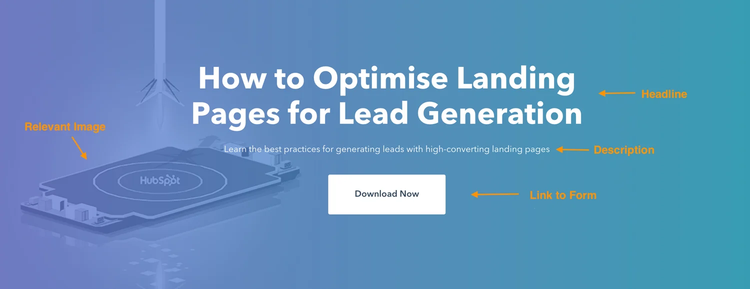
A good landing page has five elements (check out the landing page example below to see these elements in practice):
Headline that grabs the visitors attention
Relevant image that is relevant to your audience
Lead form that sits above the fold to capture visitors’ information
CTA that is action-oriented and compelling
Copy and description that informs and entices your visitor to complete your form
Can your landing page include more than this? Absolutely. (Think social share buttons that visitors can use to spread the word about your offer). This is simply the bare minimum. You need to know your audience, where they are coming from and where they are in their buyer’s journey to know how much you need to include. The rule of thumb is to include as much information as you need to get people to convert.
Landing Page Layout
This may come as a surprise, but most people don’t read every word of your cleverly-crafted copy. Instead, they skim through and pull out the most important tidbits. Your job is to make those tidbits stand out so your visitor doesn’t miss anything important.
That means a few things …
Keep the most important information above the fold so your visitor doesn’t need to scroll to get to it.
Perform a blink test on your page, meaning a visitor should be able to gather the main message in less time than it takes them to blink, i.e., less than five seconds.
Use white (or negative) space to keep your visitor engaged, focused, and to help them comprehend your message.
Write with bullets and short paragraphs to make your copy easy to digest.
Try to work the important copy into an F-pattern, which is the direction that most people scan a page online. Work with the flow of visual patterns to drive people to the key points that will get them to convert.
Landing Page Colors
The design of your landing page — including the colors you use — should reflect that of your website. You’re aiming to form a long-term relationship with the people who visit your landing page, and that means they need to become familiar with your branding colors and unique style. The more they recognize your brand, the more they trust you (and the more they trust you, the easier it is to get them to do what you want them to do).
The areas where you should consider using alternate colors are on the elements of your page that need to stand out — ahem, your CTA button. Contrast is the name of the game here. Say your branded colors are mostly green … you’ll want to choose a color that can draw users attention, say purple.
Wondering what colors perform well? We did a little research for you to determine which colors convert best.
Landing Page Images
The image on your landing page is one the first things people see, and since people process visuals far quicker than they do text, it sets the tone for their entire experience. But how can you possibly choose between millions of stock photos and that company photo shoot that’s taking up all the space on your computer?
Let’s narrow down the selection with a few important questions:
Who is my target audience?
What does your persona look like? How old are they? How do they dress? What are they interested in? The answers to these questions are important in determining what image you’re going to place front and center on your landing page. If it’s going to appeal to your audience, then it needs to represent them in some way.
Where on my landing page do I want them to look?
This might seem like an odd question, but really it’s based on the idea that people follow directional cues, like where someone is looking or pointing. If you want visitors to fill out a form, consider an image that drives their attention toward that form.
Will this image reinforce my message?
Every element on your landing page serves an important purpose. Since your image is one of the first things that people see, it should help clarify what the visitor can expect from your page. Make sure that your image adds value.
Here are some other important things to consider when creating great landing page images.
Call-to-Action (CTA)
We’ve discussed your CTA a few times so far, but since it’s the most important part of your landing page, it’s worth mentioning again. When it comes to the design of your CTA, there are a few tricks will make it so alluring that visitors feel compelled to click. To clarify, your CTA includes the button and the copy you use to draw attention to it; these tips cover both.
Give your CTA a vibrant and contrasting color
Focus your CTA copy on the benefit to your visitor
Get to the point — try using no more than five words
Tell your visitor what you want them to do using action verbs, e.g. Get, Download, Click
Make your button large enough to stand out on the page
Give it some negative space — don’t crowd the area around your CTA
Follow the flow of the page and place your CTA where your readers’ eyes will go, such as to the right of or below the copy
Test your button shape, test your copy … as a matter of fact test everything (we’ll cover how to do this below)
Can your landing page include more than this? Absolutely. (Think social share buttons that visitors can use to spread the word about your offer). This is simply the bare minimum. You need to know your audience, where they are coming from and where they are in their buyer’s journey to know how much you need to include. The rule of thumb is to include as much information as you need to get people to convert.
Landing Page Layout
This may come as a surprise, but most people don’t read every word of your cleverly-crafted copy. Instead, they skim through and pull out the most important tidbits. Your job is to make those tidbits stand out so your visitor doesn’t miss anything important.
That means a few things …
Keep the most important information above the fold so your visitor doesn’t need to scroll to get to it.
Perform a blink test on your page, meaning a visitor should be able to gather the main message in less time than it takes them to blink, i.e., less than five seconds.
Use white (or negative) space to keep your visitor engaged, focused, and to help them comprehend your message.
Write with bullets and short paragraphs to make your copy easy to digest.
Try to work the important copy into an F-pattern, which is the direction that most people scan a page online. Work with the flow of visual patterns to drive people to the key points that will get them to convert.
Landing Page Colors
The design of your landing page — including the colors you use — should reflect that of your website. You’re aiming to form a long-term relationship with the people who visit your landing page, and that means they need to become familiar with your branding colors and unique style. The more they recognize your brand, the more they trust you (and the more they trust you, the easier it is to get them to do what you want them to do).
شاهد وأحصل على أعمالنا من منصة خمسات
محدثك د .عبد الغني فؤاد حسين 18 عاماً من واقع عملي حيث اعمل مستشار وظيفي ذو خبرة وله تاريخ حافل من العمل في مجال التدريب المهني وصناعة التدريب. ماهر في المبيعات والاستشارات التعليمية والمحاسبة وإدارة المشتريات وإدارة المخزون.
سأكون مستشارك الوظيفي وأقوم بتدريبك على أودو
The areas where you should consider using alternate colors are on the elements of your page that need to stand out — ahem, your CTA button. Contrast is the name of the game here. Say your branded colors are mostly green … you’ll want to choose a color that can draw users attention, say purple.
Wondering what colors perform well? We did a little research for you to determine which colors convert best.
Landing Page Images
The image on your landing page is one the first things people see, and since people process visuals far quicker than they do text, it sets the tone for their entire experience. But how can you possibly choose between millions of stock photos and that company photo shoot that’s taking up all the space on your computer?
Let’s narrow down the selection with a few important questions:
Who is my target audience?
What does your persona look like? How old are they? How do they dress? What are they interested in? The answers to these questions are important in determining what image you’re going to place front and center on your landing page. If it’s going to appeal to your audience, then it needs to represent them in some way.
Where on my landing page do I want them to look?
This might seem like an odd question, but really it’s based on the idea that people follow directional cues, like where someone is looking or pointing. If you want visitors to fill out a form, consider an image that drives their attention toward that form.
Will this image reinforce my message?
Every element on your landing page serves an important purpose. Since your image is one of the first things that people see, it should help clarify what the visitor can expect from your page. Make sure that your image adds value.
Here are some other important things to consider when creating great landing page images.
Call-to-Action (CTA)
We’ve discussed your CTA a few times so far, but since it’s the most important part of your landing page, it’s worth mentioning again. When it comes to the design of your CTA, there are a few tricks will make it so alluring that visitors feel compelled to click. To clarify, your CTA includes the button and the copy you use to draw attention to it; these tips cover both.
Give your CTA a vibrant and contrasting color
Focus your CTA copy on the benefit to your visitor
Get to the point — try using no more than five words
Tell your visitor what you want them to do using action verbs, e.g. Get, Download, Click
Make your button large enough to stand out on the page
Give it some negative space — don’t crowd the area around your CTA
Follow the flow of the page and place your CTA where your readers’ eyes will go, such as to the right of or below the copy
Test your button shape, test your copy … as a matter of fact test everything (we’ll cover how to do this below)
Can your landing page include more than this? Absolutely. (Think social share buttons that visitors can use to spread the word about your offer). This is simply the bare minimum. You need to know your audience, where they are coming from and where they are in their buyer’s journey to know how much you need to include. The rule of thumb is to include as much information as you need to get people to convert.
Landing Page Layout
This may come as a surprise, but most people don’t read every word of your cleverly-crafted copy. Instead, they skim through and pull out the most important tidbits. Your job is to make those tidbits stand out so your visitor doesn’t miss anything important.
That means a few things …
Keep the most important information above the fold so your visitor doesn’t need to scroll to get to it.
Perform a blink test on your page, meaning a visitor should be able to gather the main message in less time than it takes them to blink, i.e., less than five seconds.
Use white (or negative) space to keep your visitor engaged, focused, and to help them comprehend your message.
Write with bullets and short paragraphs to make your copy easy to digest.
Try to work the important copy into an F-pattern, which is the direction that most people scan a page online. Work with the flow of visual patterns to drive people to the key points that will get them to convert.
Landing Page Colors
The design of your landing page — including the colors you use — should reflect that of your website. You’re aiming to form a long-term relationship with the people who visit your landing page, and that means they need to become familiar with your branding colors and unique style. The more they recognize your brand, the more they trust you (and the more they trust you, the easier it is to get them to do what you want them to do).
The areas where you should consider using alternate colors are on the elements of your page that need to stand out — ahem, your CTA button. Contrast is the name of the game here. Say your branded colors are mostly green … you’ll want to choose a color that can draw users attention, say purple.
Wondering what colors perform well? We did a little research for you to determine which colors convert best.
Landing Page Images
The image on your landing page is one the first things people see, and since people process visuals far quicker than they do text, it sets the tone for their entire experience. But how can you possibly choose between millions of stock photos and that company photo shoot that’s taking up all the space on your computer?
Let’s narrow down the selection with a few important questions:
Who is my target audience?
What does your persona look like? How old are they? How do they dress? What are they interested in? The answers to these questions are important in determining what image you’re going to place front and center on your landing page. If it’s going to appeal to your audience, then it needs to represent them in some way.
Where on my landing page do I want them to look?
This might seem like an odd question, but really it’s based on the idea that people follow directional cues, like where someone is looking or pointing. If you want visitors to fill out a form, consider an image that drives their attention toward that form.
Will this image reinforce my message?
Every element on your landing page serves an important purpose. Since your image is one of the first things that people see, it should help clarify what the visitor can expect from your page. Make sure that your image adds value.
Here are some other important things to consider when creating great landing page images.
Call-to-Action (CTA)
We’ve discussed your CTA a few times so far, but since it’s the most important part of your landing page, it’s worth mentioning again. When it comes to the design of your CTA, there are a few tricks will make it so alluring that visitors feel compelled to click. To clarify, your CTA includes the button and the copy you use to draw attention to it; these tips cover both.
Give your CTA a vibrant and contrasting color
Focus your CTA copy on the benefit to your visitor
Get to the point — try using no more than five words
Tell your visitor what you want them to do using action verbs, e.g. Get, Download, Click
Make your button large enough to stand out on the page
Give it some negative space — don’t crowd the area around your CTA
Follow the flow of the page and place your CTA where your readers’ eyes will go, such as to the right of or below the copy
Test your button shape, test your copy … as a matter of fact test everything (we’ll cover how to do this below)
شاهد وأحصل على أعمالنا من منصة خمسات
بمساعدة كتابتنا المهنية لأكثر من 15 عاماً، ستصبح مؤلف الكتب الأكثر مبيعًا. واحدة من أفضل الطرق لتغيير قرائك هي من خلال كتابة كتاب جيد. سوف أكتب كتابك الأليكتروني بطريقة إحترافيه لدينا رحلة تعلم ونجاح رائعة من شأنها إشراك جمهورك. سوف يكتبون أيضًا مخطوطة مركزة وقوية